Designing for Efficiency: More UI Enhancements!
Many of you probably found yourselves in a welcome center or hotel lobby over the summer. You might have browsed through brochures in a display rack, making sure you didn’t miss anything important while planning your trip. Before the days of the internet—yes, there was a time when people didn’t have internet access—the brochure stand was the ultimate concierge, offering a glimpse into all the activities available in the area. However, back then, there was no easy way to organize those brochures or gather essential details like distance, cost, and overall enjoyment. Now, with digital tools literally at our fingertips, it’s hard to imagine planning a trip any other way.
Just like those brochure stands, our database serves as a guide to information. But sometimes, we need enhancements that bring all this information together in a more user-friendly way.
In April, we released a blog about User Interface (UI) enhancements for the Workflow and Registration pages. UI enhancements are some of my favorite updates to share because they make work more enjoyable by eliminating the struggle to accomplish tasks that should be simple. We have a few more ideas for UI enhancements that I think you’ll love.
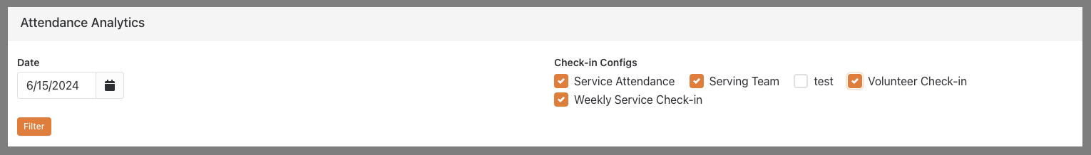
Now, imagine you just completed check-in over the weekend and want to view the totals from all your check-in configurations in one place. This is where the Attendance Analytics page comes in. However, you know it can feel like sorting through a messy rack of brochures if you have multiple groups in your configurations. Moreover, your report details might be incorrect if the user doesn’t select the right options. While this page does offer some great features, like Charts and Attendance Details, it can still be daunting to use.
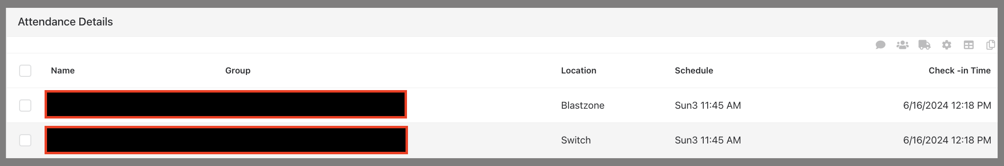
We have a solution that I believe you’ll find incredibly useful. Imagine an attendance dashboard that allows you to choose one or more check-in configurations and view attendance details for a specific date. This means you can see all your volunteers, students, kids, and more in a single list. You’ll also be able to see which location and schedule they belong to and easily toggle the list to group them accordingly
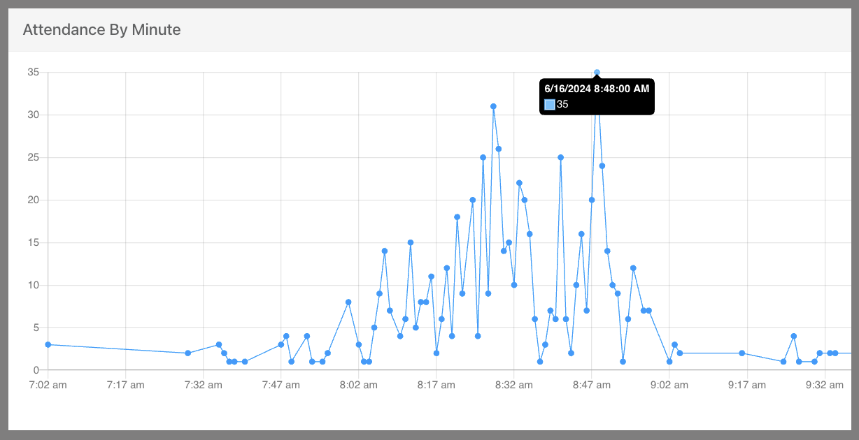
Imagine a dot chart displaying minute-by-minute check-in data. This visualization can greatly enhance volunteer scheduling and help analyze traffic patterns at check-in stations. By hovering over a dot, you can see the exact date and number of people who checked in during that specific minute. These insights allow for more accurate predictions of traffic flow, leading to more effective volunteer scheduling.
When someone asks for totals, they can get the answer at a glance—no more manually adding totals from different configurations.
Here’s a quick overview of how it works:
- A dynamic data block, using SQL and customized lava results, provides a minute-by-minute view of real-time check-in data.
- Another dynamic data block aggregates information from all active check-in configurations to deliver comprehensive Attendance Details..
- Behind it all, parameter filters make it easy to customize and refine the results to fit your needs.
Our example filter is set to one date at a time but can be customized to meet your specific search needs.
Now, let’s delve into the second enhancement I think everyone should have:
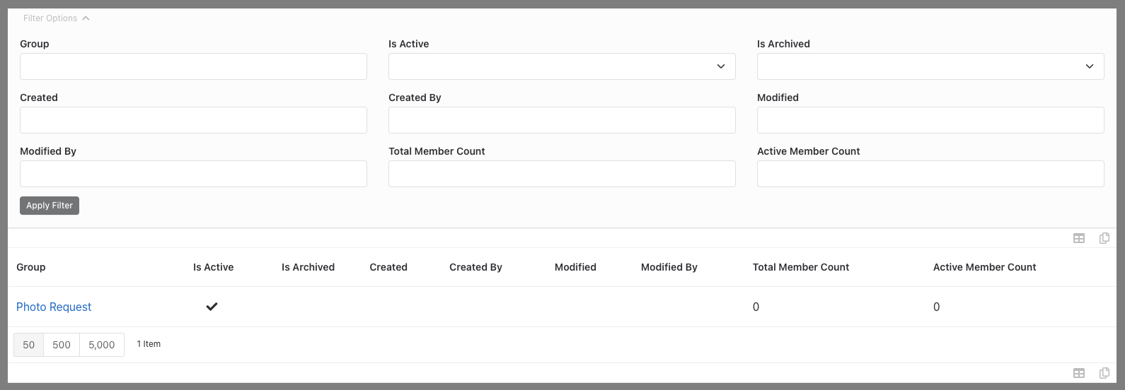
How many times have you navigated to the Group Type page, found your group type, but then hit a roadblock when trying to locate all the groups within that type? This tool allows users to easily find every group of a certain group type with just one click. Just like a directory helps you find specific types of attractions and services, this tool enables employees to effortlessly locate and manage specific groups within the database. It simplifies the process, saving time and reducing frustration."
Here's how it works:
We'll add a search button to every group type in the Group Types list, allowing you to simply click a button to find every group of that type.
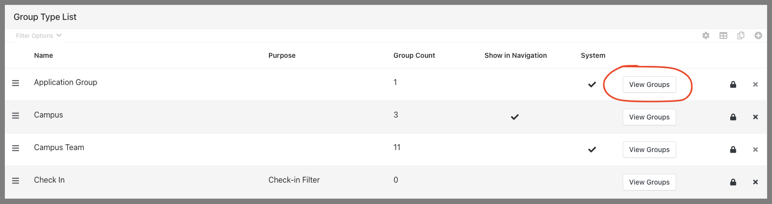
The results page provides a clickable list of groups, which you can filter by various criteria, such as Active or Inactive status, Total Member Count, and more. This makes troubleshooting or simply finding all your groups of a certain type much more time-efficient.
With these tools in place, you will spend less time trying to figure things out and more time producing results.
What's Next?
The installation process for the Check-In Details tool and the Groups of Group Type Finder each takes about two hours. If you'd like to have either of these amazing tools installed in your system, click the button below to let us know, and we’ll be in touch soon!
If you are not currently a client, a one-time fee will be required before implementing any features.
*Looking Ahead
Next month, we'll dive into processes for prompting a church-wide profile update that doesn’t require users to log in.
Process for Accuracy: Church-Wide Profile Updates
Keeping profile information up-to-date is essential for effective communication and streamlined operations. In our next blog, we’ll explore a church-wide communication strategy that allows users to easily update their personal information without the hassle of logging in. You’ll wonder how you ever managed without this process.